


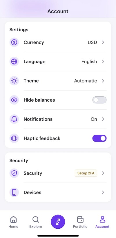
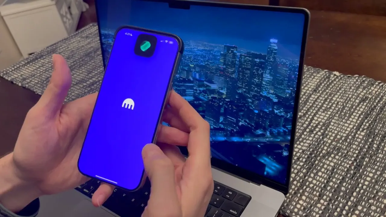
Simplifying Kraken's UI for Mass Market Appeal

Staff Product Designer
2020 - 2024
4 yrs 1 mo
Objective
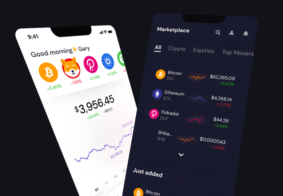
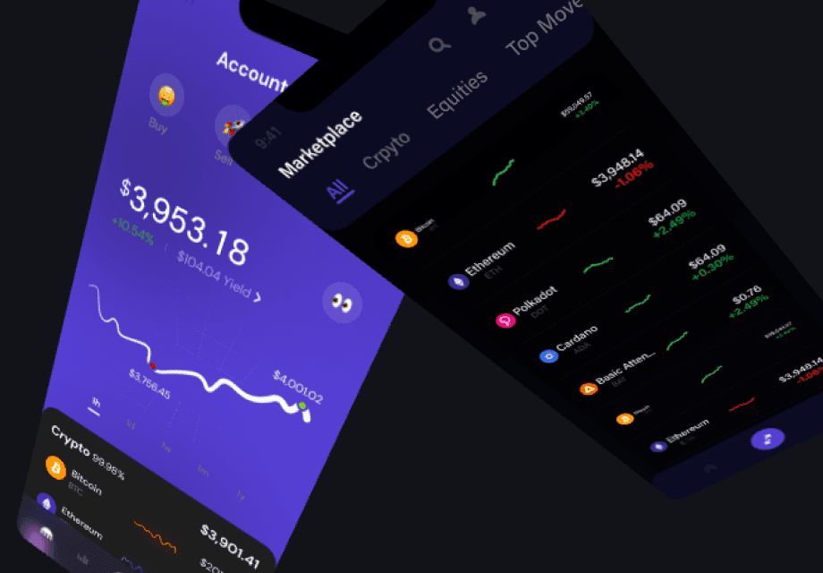
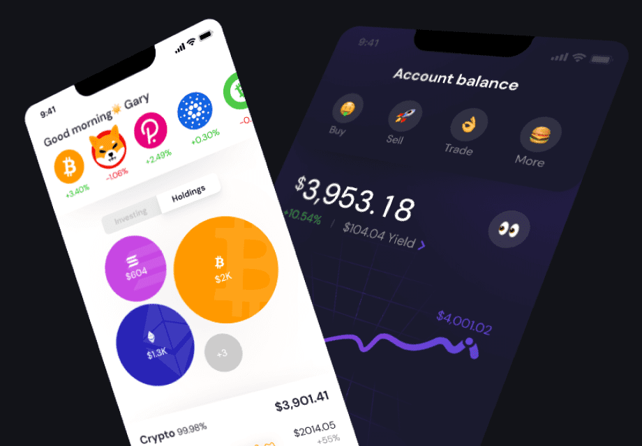
The goal was to refresh Kraken’s interface to attract new users during the 2021 bull run while keeping it familiar for those already on board.

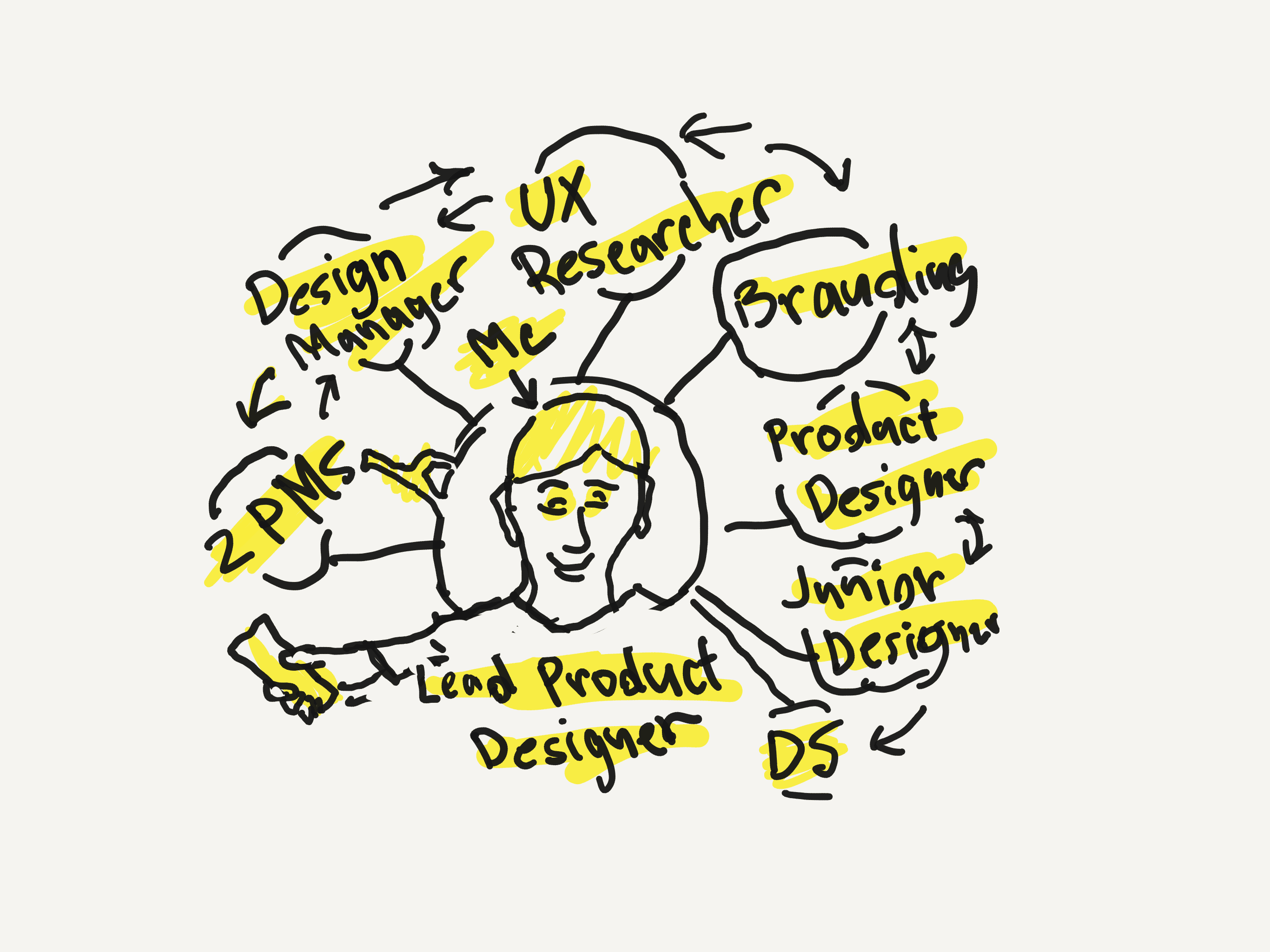
The Team
I worked together with the research, product, development, customer service, and branding teams to simplify navigation, improve performance, boost security, and make everything more accessible.

Ui Exercise
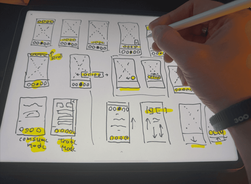
I did rapid experiments using popular products to enhance our exploration and uncover ideas I hadn’t considered before.
Design Critiques
Participated in design critiques, ensuring everyone's voices are heard and leveraging constructive feedback to enhance the designs.
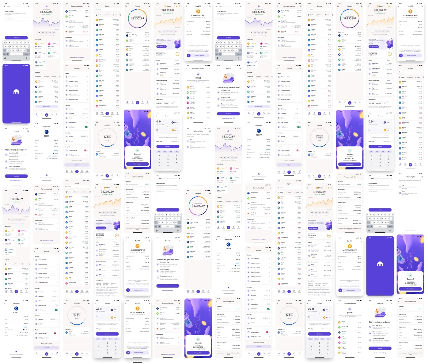
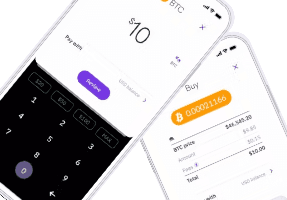
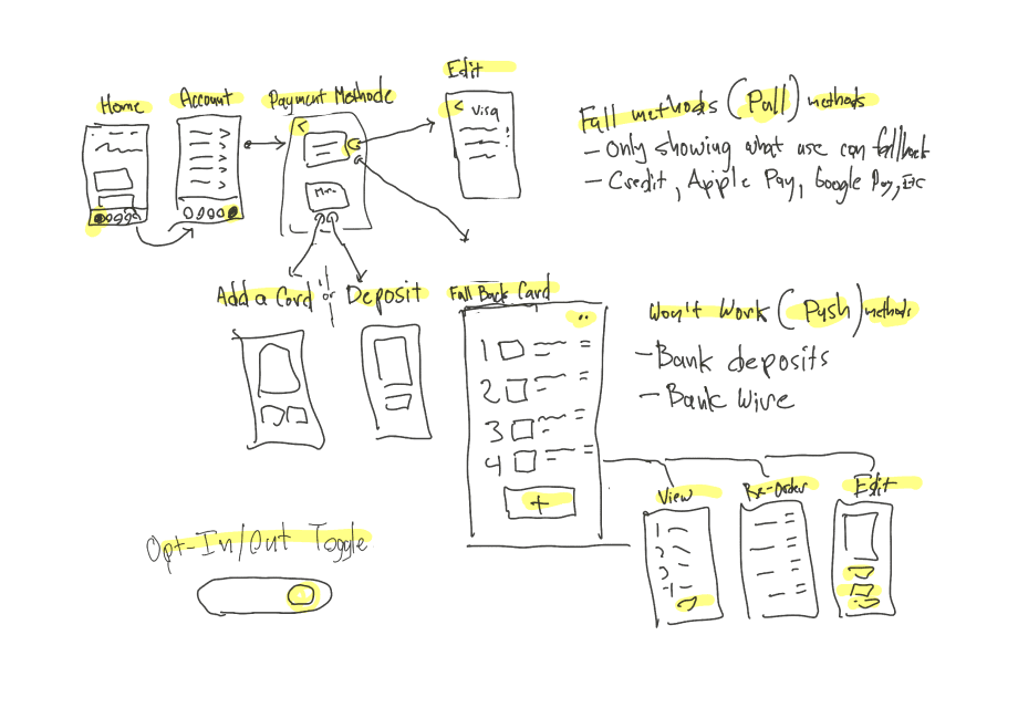
Prototype Time
My goal was to redesign Kraken’s interface for broader appeal while preserving familiarity for existing users.
Design System Rollout
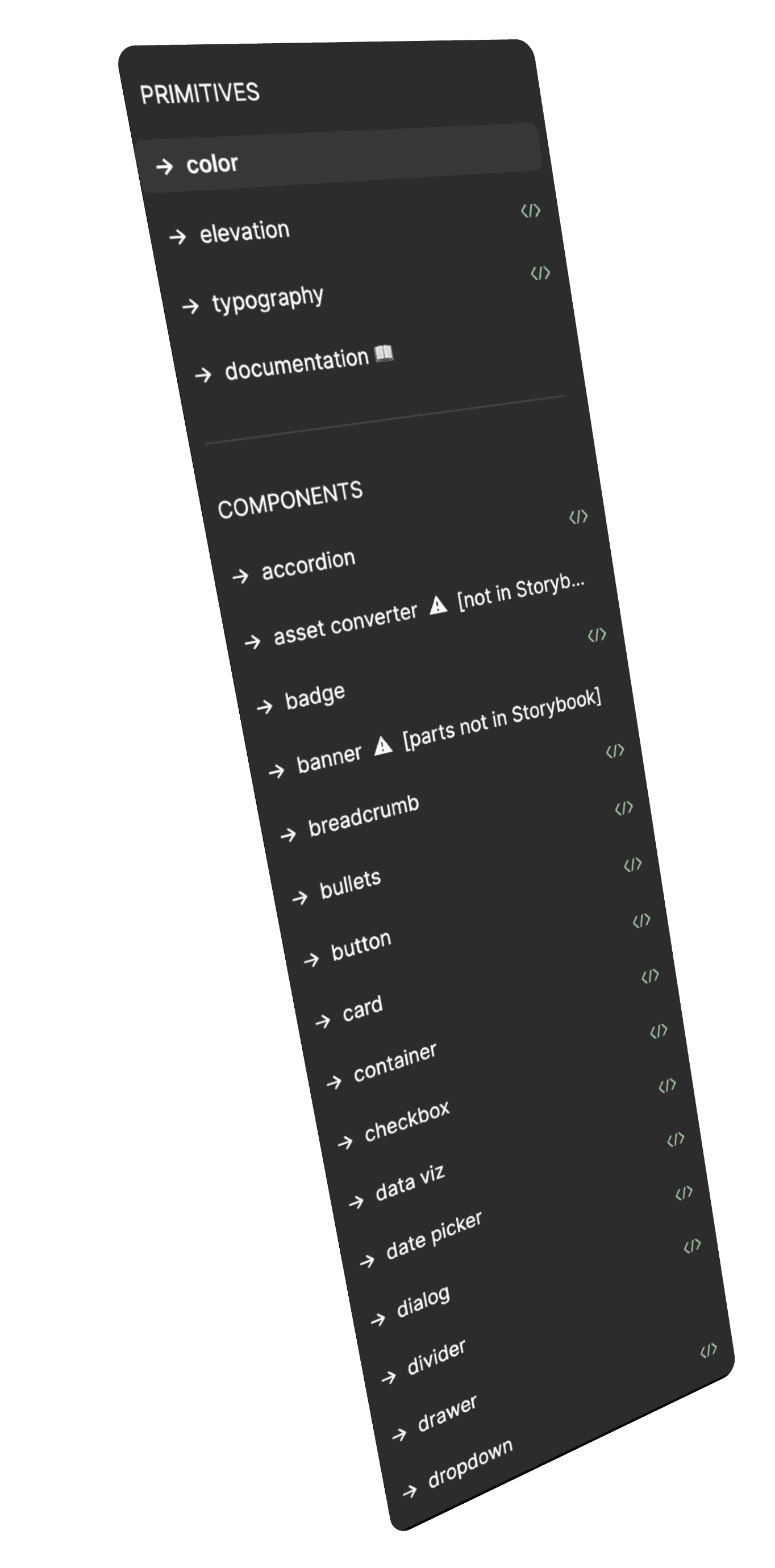
I created reusable UI components, handed them over to Kraken’s design systems team, and helped write guides to ensure all designers use them correctly.
Performance & Security
Teamed up closely with developers to ensure everything was optimized to the fullest.
Results & Impact
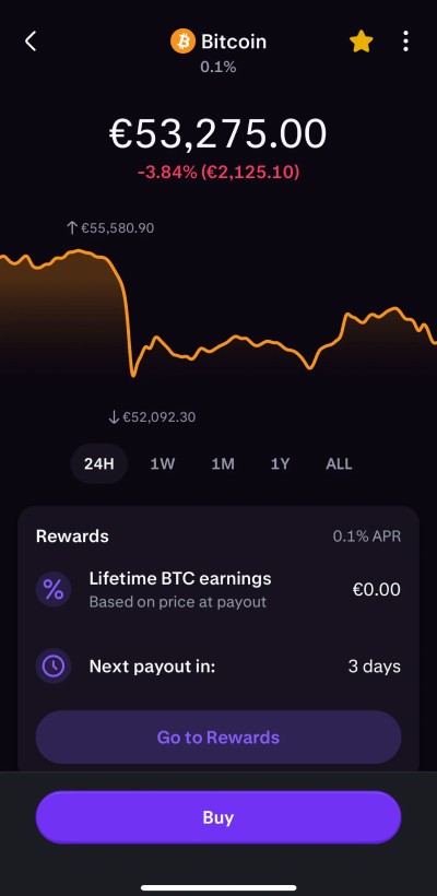
Made the platform simpler, so new crypto users can navigate everything without hassle.

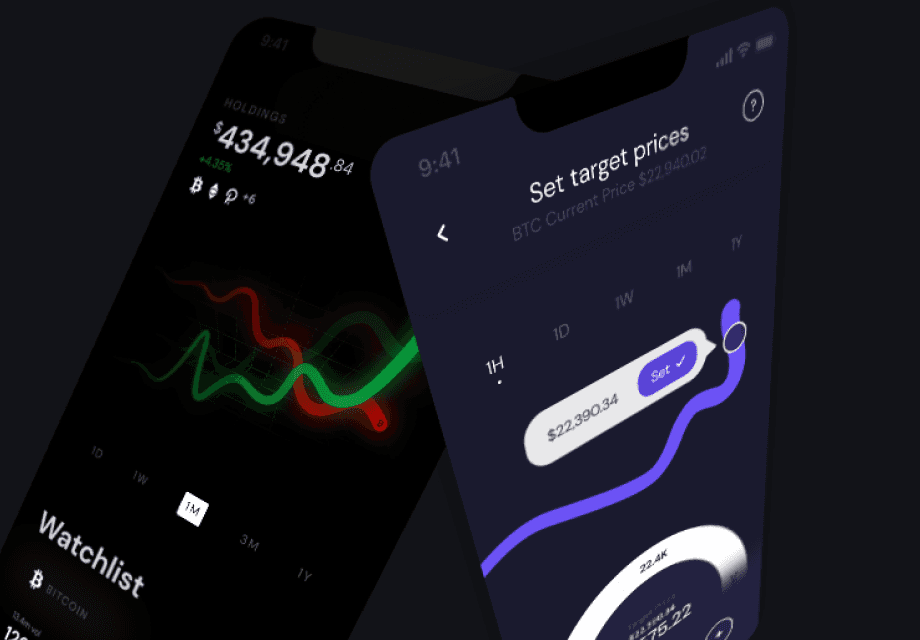
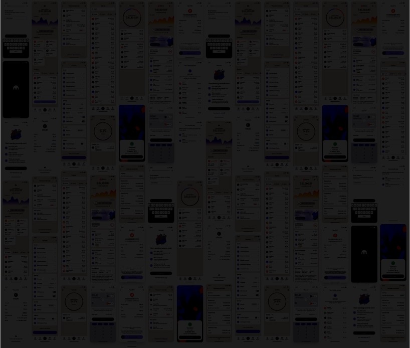
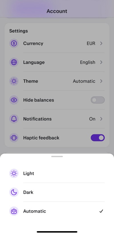
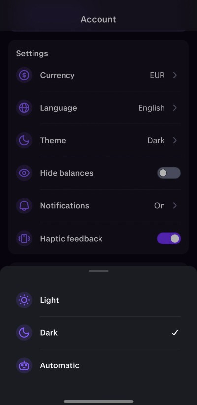
Dark Mode
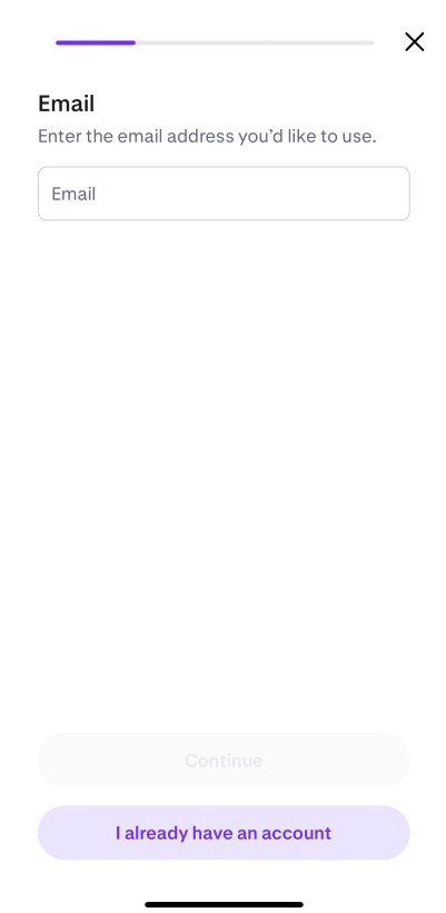
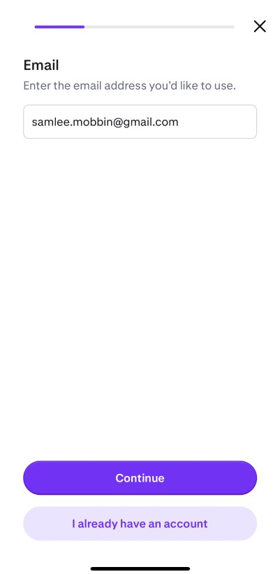
Onboarding


Transaction
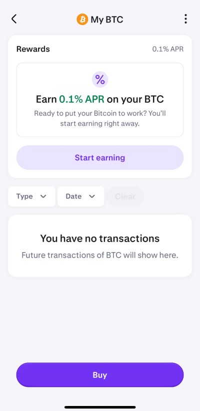
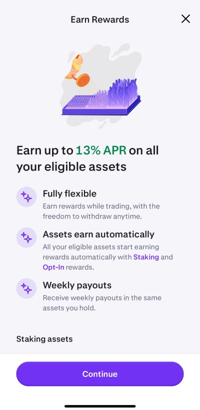
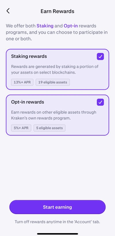
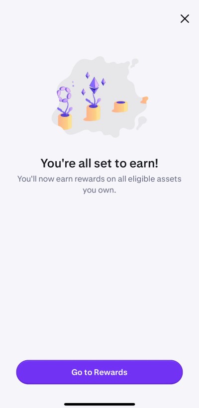
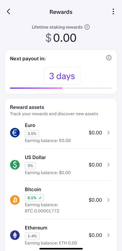
Earn/Rewards
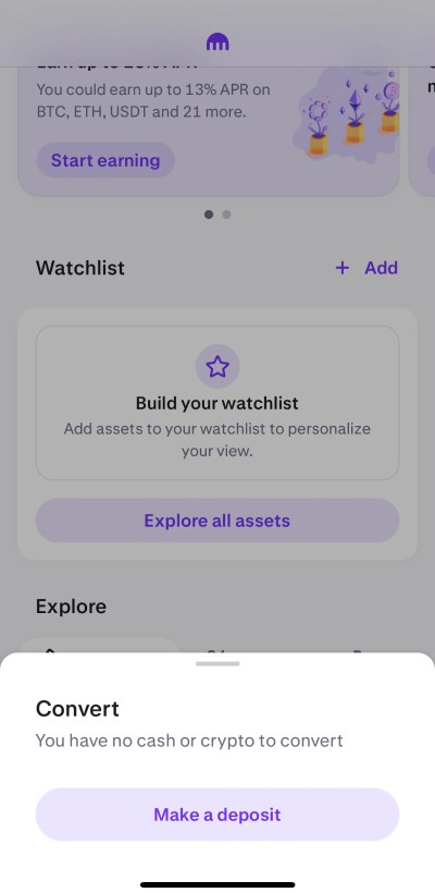
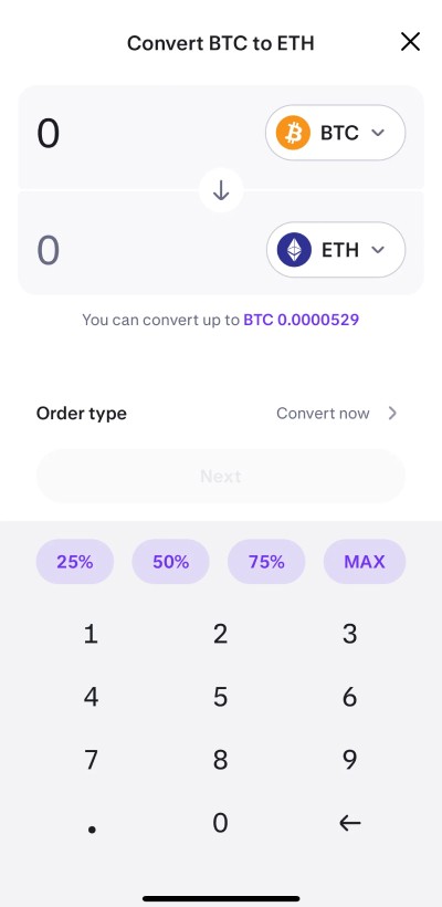
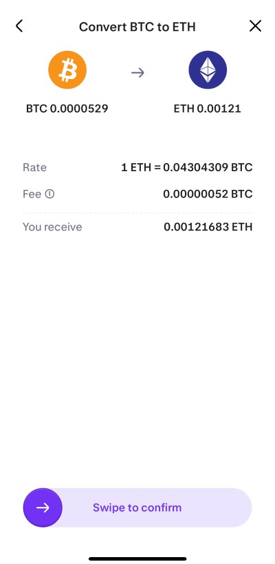
Token Swap

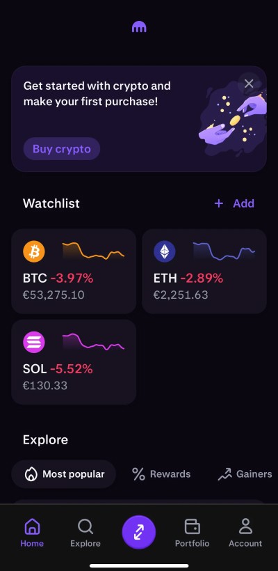
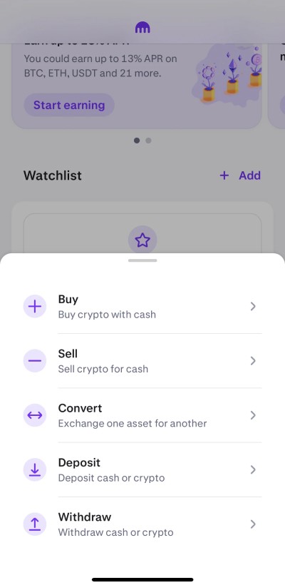
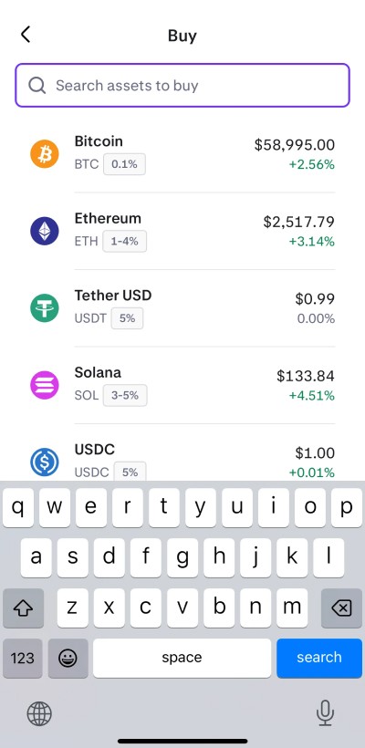
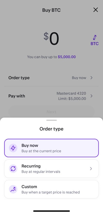
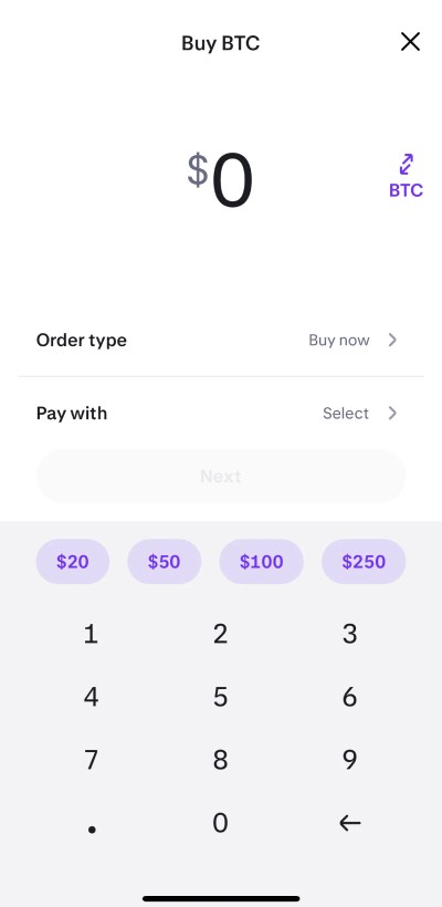
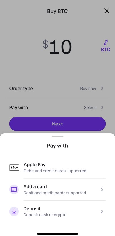
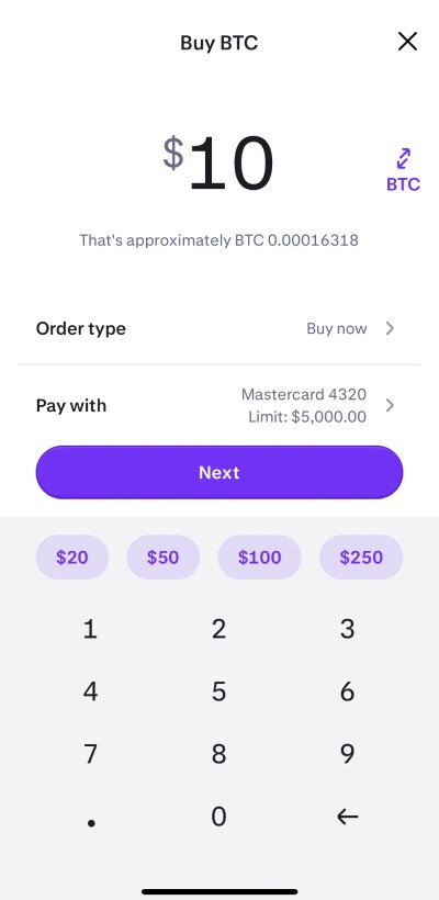
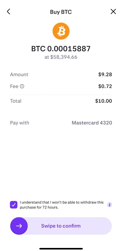
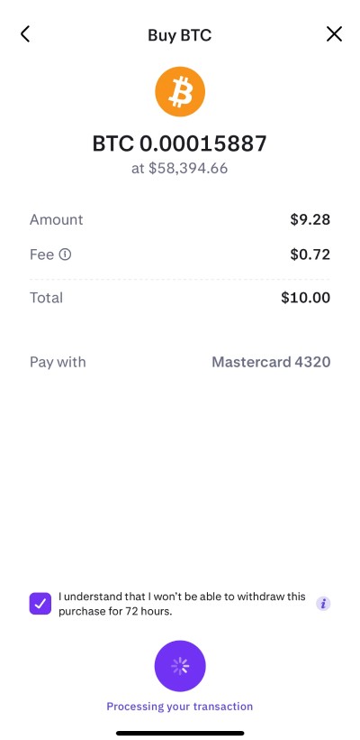
Live Example 👇
How did you know you were solving the right problem?
To confirm we were addressing the correct issues, I collaborated with a researcher to conduct usability tests specifically with non-pro users. Through these sessions, we repeatedly encountered the same needs and pain points.
This consistent feedback validated that our design decisions—focused on simplicity, clarity, and user support—were indeed solving the real problem and aligning with user expectations.
Team and collaboration
I spearheaded the project, collaborating closely with another UX designer, a UX researcher, a product manager, and a developer.
My manager tasked me with leading this large initiative after our UX research indicated a strong need among new, retail users entering the market. Working alongside the product manager and researcher, I explored various design directions and facilitated design critiques with designers, product teams, and developers to iterate on what worked best.
I also coordinated with product and design managers to ensure deadlines were met, and ultimately handed off the finalized designs to the design system team for componentization and documentation.
Handling challenges and differing Opinions
Project Scope and Deadlines
The project risked becoming unmanageable without clear deadlines. To address this, I worked with the product team to set specific deadlines and, when necessary, broke the project into smaller, more manageable pieces.Conflicting Aesthetic Preferences
Some stakeholders favored a flashy aesthetic while others wanted a minimalist, clean design. To reconcile these differences, I developed simple prototypes featuring both aesthetics and conducted user testing.Collaborating with researchers
We found that although users appreciated elements of the flashier design, they overwhelmingly preferred a straightforward UI that met their needs quickly and without friction. Based on this feedback, we decided to maintain a clean design while structuring it to allow for the addition of subtle enhancements in the future.
We researched new users and learned they wanted
Quick, built-in educational resources.
Strong security and guided support.
Continued access to the classic UI for experienced users, with clear plans for its phase-out.
Make it simple enough that even someone’s older parent or a less tech-savvy user can navigate with ease.
Prioritization & design influence:
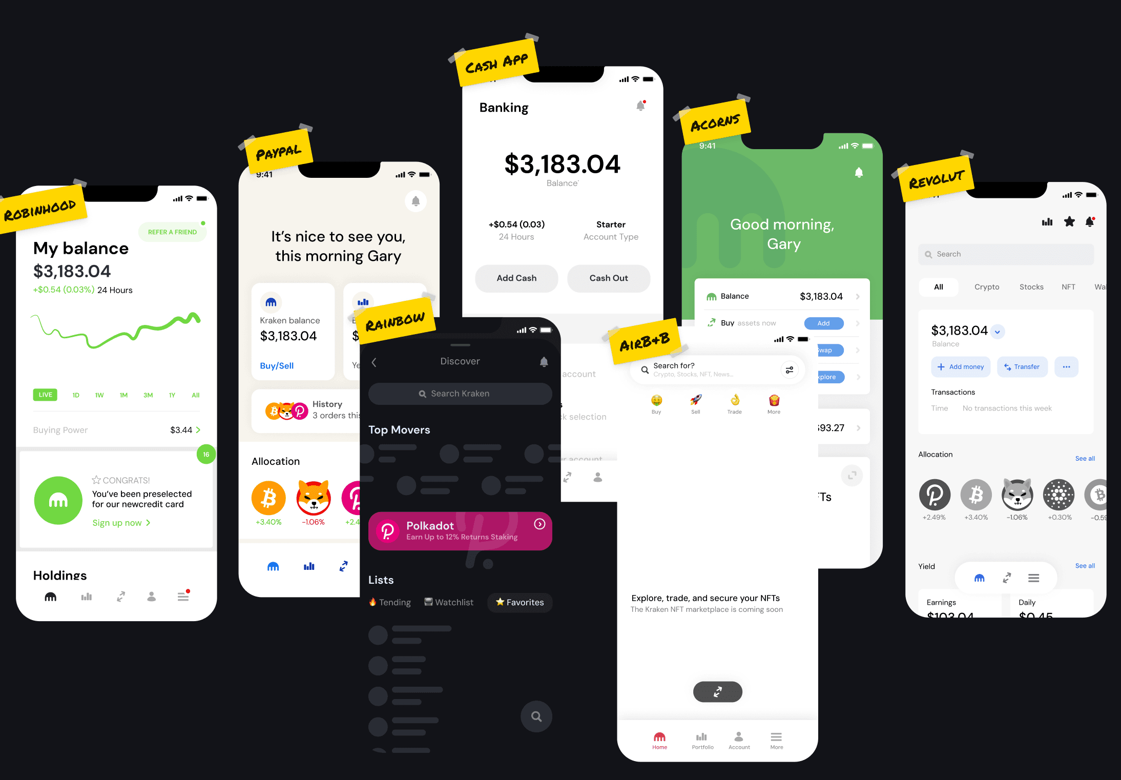
Study competitors like Coinbase, Robinhood, and Binance to identify established patterns and align with industry best practices. We focused on simplifying the interface, adding educational elements, and enhancing security based on user feedback.
Frequent testing ensured the design met these needs, creating an intuitive, secure UI for newcomers while still supporting seasoned users.
🎨 Design choices and solutions
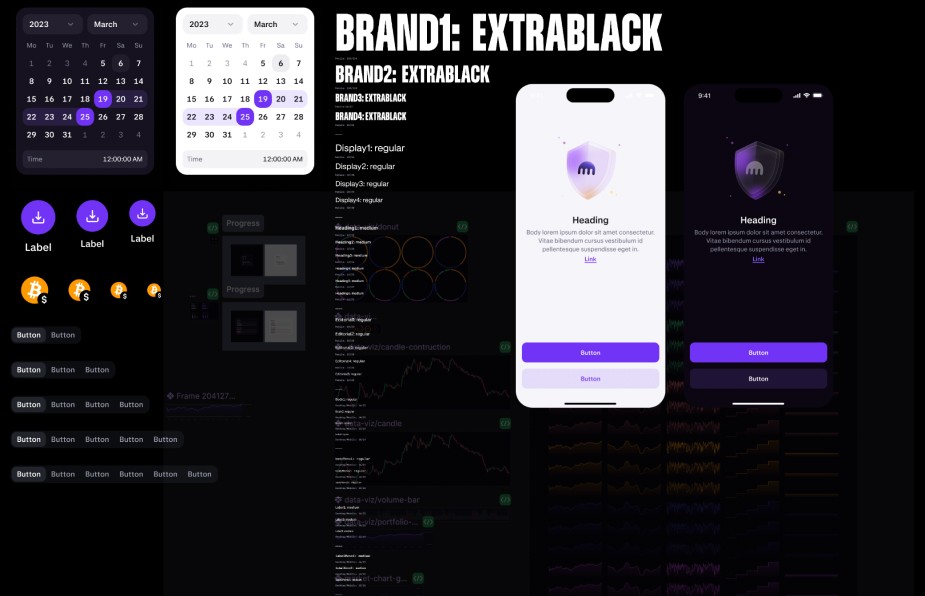
Given that our brand identity was undergoing a refresh, we aimed to maintain key elements like our signature purple tones paired with subtle grey, ensuring the design remained accessible and visually calm for consumers.
Accessibility
We prioritized meeting accessibility standards by choosing colors and contrasts that ensured readability and usability for all users.
Platform focus
We prioritized meeting accessibility standards by choosing colors and contrasts that ensured readability and usability for all users.
Brand collaboration
We collaborated with the brand team to introduce minimalist spot art in purple tones, complementing our clean interface and reinforcing brand identity, without distracting from usability on both mobile and desktop.
Multiple language support
We tested and verified the design in a variety of languages—including right-to-left scripts and those like German with very long words—to ensure consistency and usability across all supported regions.
Guided by choices
Through these design choices, we ensured our visuals aligned with our evolving brand, addressed user needs, and kept everything simple, secure, and welcoming. We also built every element—from components and CTAs to spacing—with room to grow, making it easy to add new features or adjust in the future.
What I learned from this project
User-Centric Design: I learned to center decisions on actual user needs through research and testing, ensuring every design choice genuinely served users while also being adaptable for other designers in future flows.
Collaboration and Building Relationships
Working with various teams—designers, researchers, product managers, and developers—I built strong relationships with colleagues I hadn’t worked with before. This taught me effective communication, managing different opinions, and steering teams with data-backed decisions.
Iterative Process
I discovered the value of iterating designs based on ongoing feedback. Prototyping, testing ideas, and refining them made me flexible and responsive to user needs.
Balancing Simplicity and Brand
I learned to merge a clean, simple interface with our upcoming brand’s visual identity, making sure the design was both appealing and easy to use.
Strategic Planning
Handling a large project taught me to break work into manageable pieces, set clear deadlines, and tackle scope challenges proactively
Overall, this project reinforced the importance of user-centered design, teamwork, adaptability, and strong cross-team relationships, preparing me for future challenges in creating intuitive and inclusive experiences.
Outcomes
We addressed challenges by working closely with stakeholders, prototyping different ideas, and testing them with users to see what truly worked.
Trade-offs and Decisions
Balancing Aesthetics vs. Simplicity
Stakeholders liked a flashy design, but user feedback favored a clean, simple interface. We prioritized simplicity because it best met user needs.
Managing Time and Scope
Due to tight deadlines, we broke the project into smaller parts. This meant delaying or simplifying some secondary features to focus on what mattered most.
How I decided on things
We made choices based on clear user feedback, accessibility requirements, and project priorities, always aiming for a design that was both functional and welcoming.
Measuring the Success of the Design
We evaluated the success of our design system for both web and mobile through several key methods
Component Usage Analysis
Using Figma’s internal tools, we monitored which components and key screens were most frequently used, and in what contexts. This helped us understand how well the design system fit real-world needs.
Identifying Issues
We looked for patterns of misuse or consistent “breaking” of components. If repetitive feedback or common issues arose, this signaled the need to create a specific component tailored to that scenario.
Continuous Improvement
By combining component usage data and user feedback, we could refine the design system over time, ensuring it remained effective, consistent, and easy for teams to use.
This data-driven approach allowed us to measure design success, identify areas for improvement, and continuously enhance the system to better serve its users.
What problem were you trying to solve?
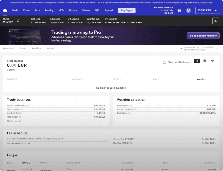
With the fast-approaching 2020/21 bull run, Kraken's UI was largely tailored to pro users, creating a steep learning curve for novice, consumer-level participants.
I aimed to address the challenge of making the platform more welcoming and intuitive for beginners who would soon flood in due to the surge in market interest.
What were the project goals?
Radically Simplify the UI
Focus on a clean, minimalist layout to reduce user confusion.
Use a Proven, Research-Backed Aesthetic
Base design decisions on data and testing to ensure effectiveness.
Cater to New User Demographics
Recognize that a separate platform will address pro users, so keep this UI beginner-friendly.
Ensure Responsive Compatibility
Test extensively on physical devices to verify a smooth experience across different screen sizes.
Align with Other Teams (e.g., Pro)
Maintain consistency where possible while still simplifying the interface for newcomers.
Instill a Sense of Security
Provide clear cues and options for immediate hand-holding through accessible customer service.

